Portfolio Grader 500
Incredibly powerful stock analysis tool for individual investors
Turning a static PDF into a dynamic stock analysis experience.
The Portfolio Grader 500 is a premium stock analysis tool curated by renowned growth investor Louis Navellier. Previously available only as a static PDF, it listed the top 250 and bottom 250 stocks in the market each quarter. As demand grew for a more user-friendly digital version, I led the design of a responsive website that transformed the report into an interactive experience.
As a lead designer, I've collaborated closely with marketing editors and developers to craft an intuitive and responsive experience across desktop and mobile.
Responsibilities
User Experience Design
User Interface Design
Visual Design
Prototyping
Key Problems
No Big Picture
The PDF version didn't offer a full overview of the 500 stocks, making it hard for users to scan or explore the entire list.
Outdated & Static
Since the PDF was published quarterly, users couldn’t access updated performance data or explore historical trends dynamically.
Visual Noise
The original design used excessive colors and had a poor hierarchy, making it difficult for users to focus on the information that mattered.
Key Solutions
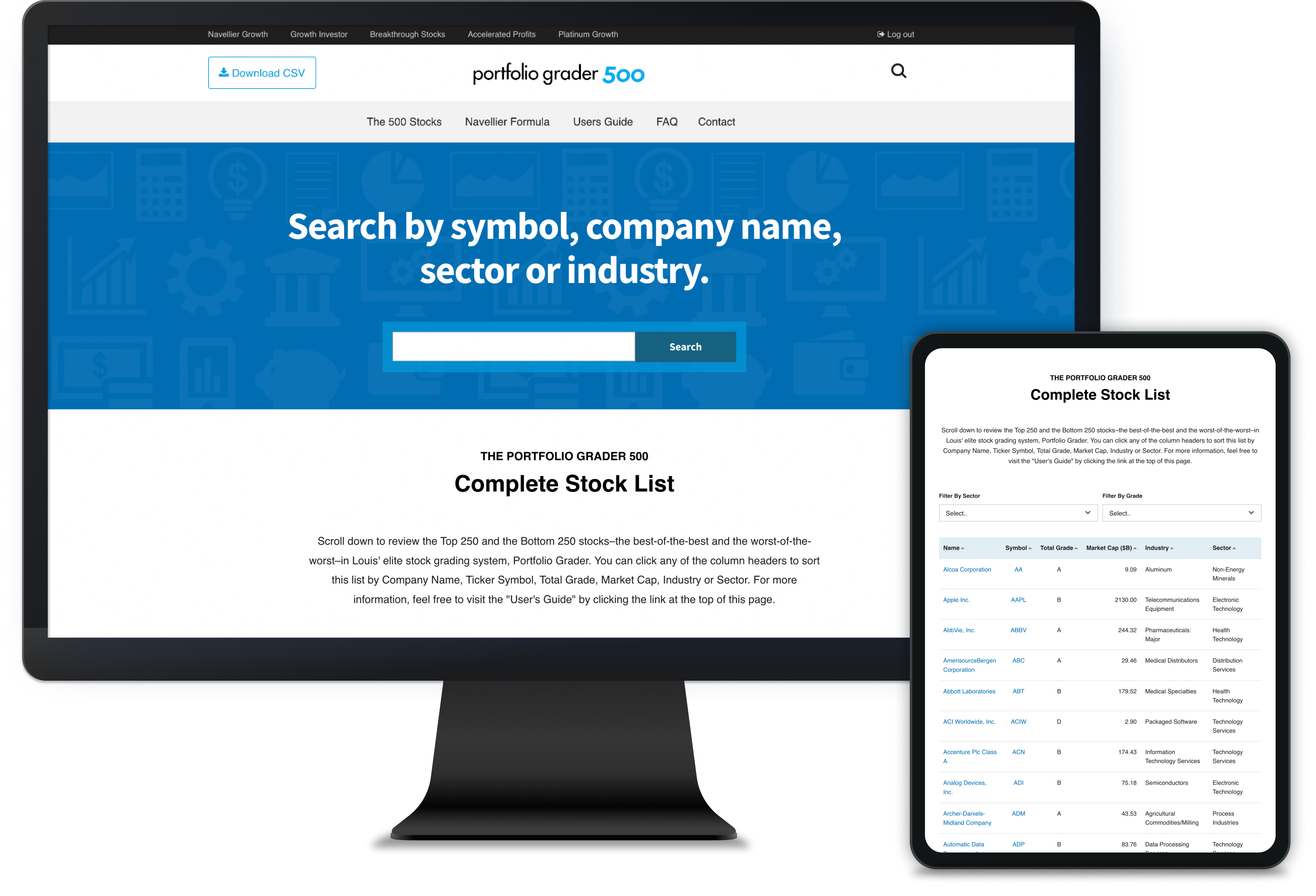
Comprehensive Stock List
A new master list allows users to view all 500 stocks at a glance with key details—no more jumping through static pages.
Powerful Search & Filter
We implemented a versatile search bar that lets users look up ticker symbols, company names, sectors, or industries in seconds.
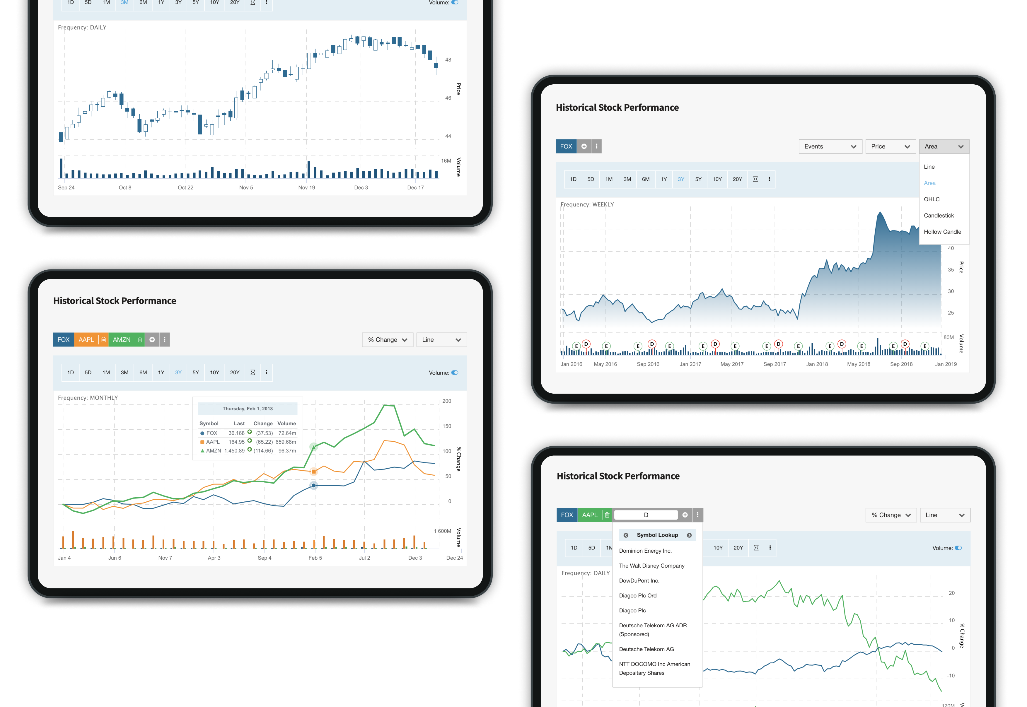
Interactive Stock Reports
Stock detail pages now feature dynamic performance charts and improved layouts, making analysis faster and more personalized.
Final design
Easy & Simple Navigation
To replace the limitations of the static PDF, I designed a master list showing all 500 stocks in a clean, scannable format. Each stock item links to a detailed view, making exploration quick and seamless.
A global search bar was added to the homepage, allowing users to instantly find a specific ticker, company name, or sector. On mobile, I optimized the layout with collapsible cards and thumb-friendly interactions to ensure smooth browsing across devices.

The PDF version of Portfolio Grader 500
Final design
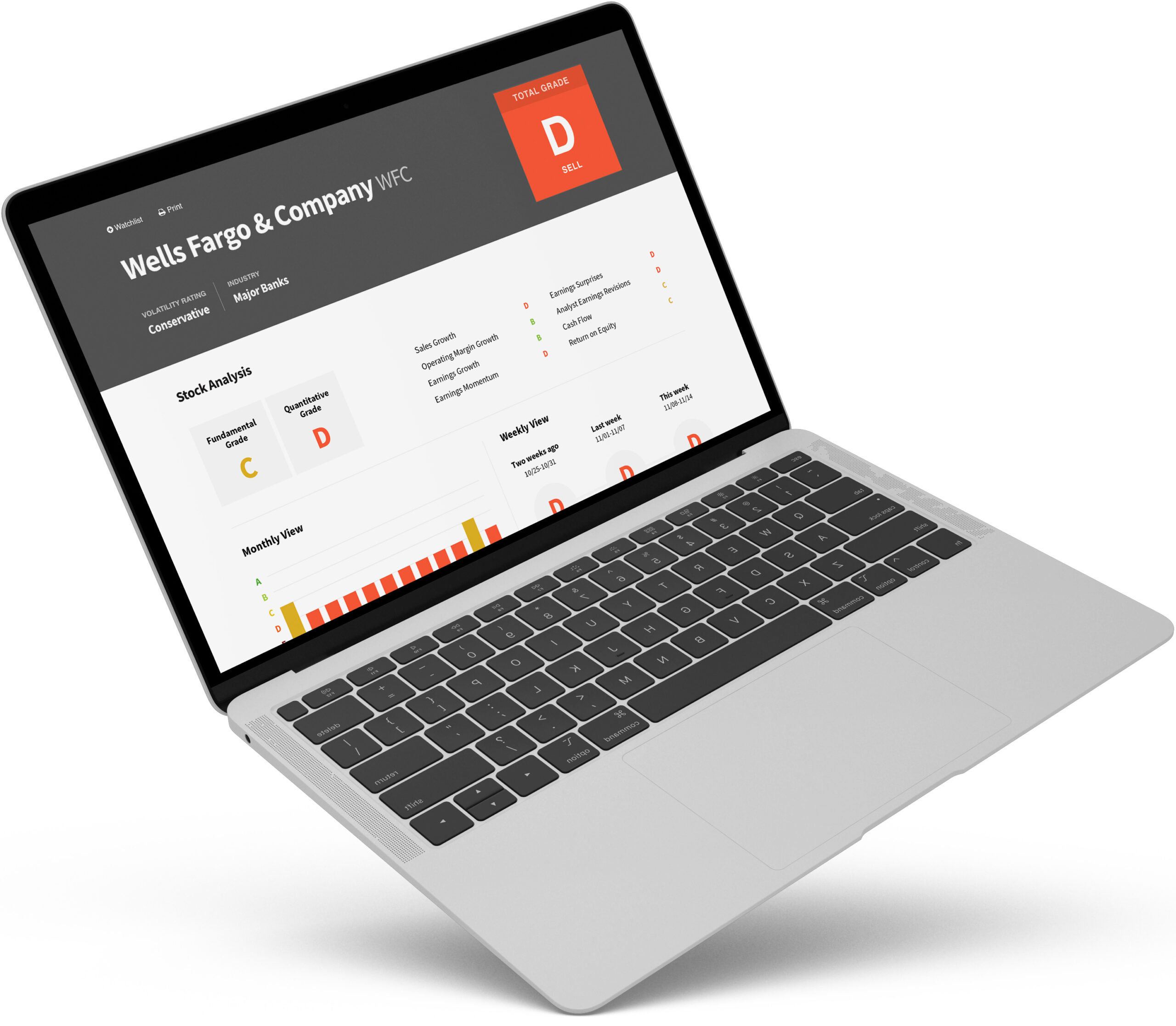
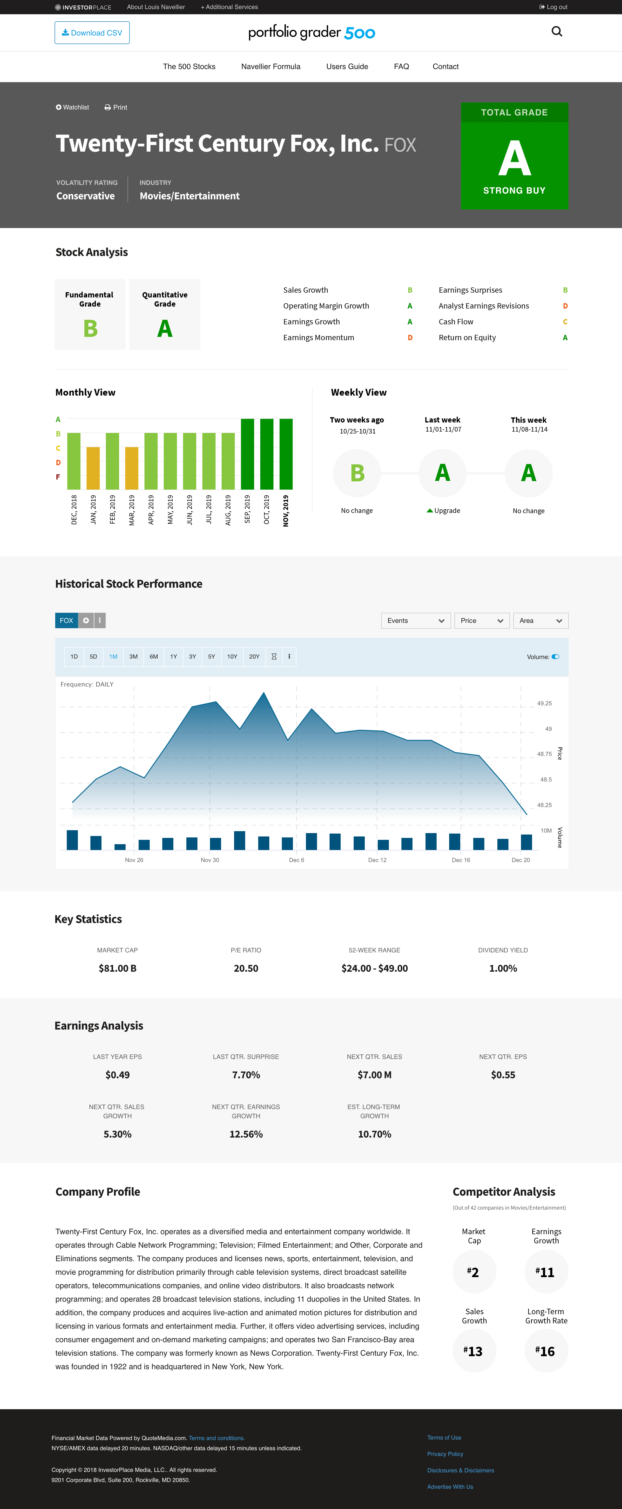
Clear and Actionable Stock Reports
I restructured the stock report layout into clear, easy-to-digest sections—starting with the grade summary and followed by key financial metrics.
Static charts were replaced with interactive components, allowing users to explore real-time data and toggle between time ranges.
To enhance clarity, I refined the visual design with a minimal color palette, clean typography, and thoughtful spacing, helping users focus on what matters most.
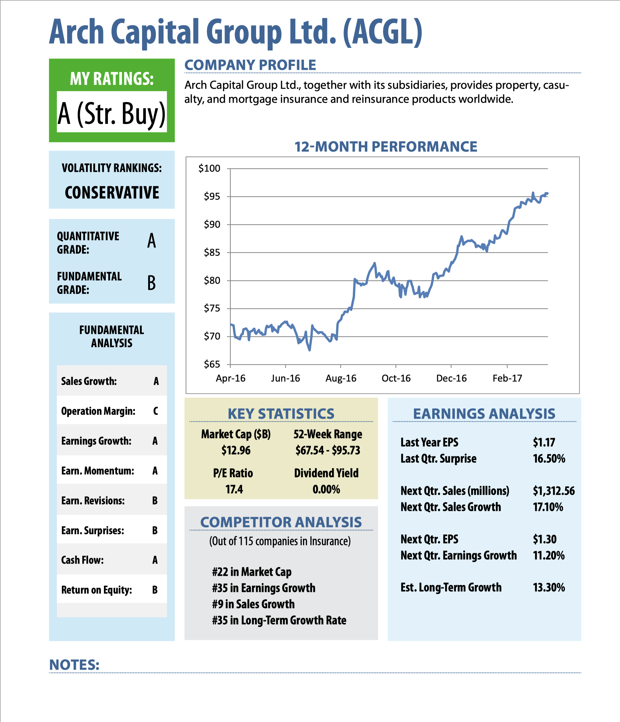
The PDF version of 'Stock Reports' page

©2024 Insun Lee All rights reserved.