The Independent
Vanguard Fund Analyzer
Possibly the most comprehensive Vanguard research tool ever built
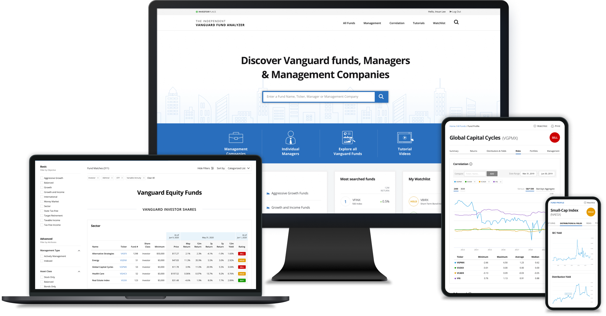
Reimagining a long-standing print guide as a digital-first research tool for today’s investors.
For nearly 30 years, Daniel Wiener has published the Independent Guide to Vanguard Funds — a trusted annual guidebook offering a comprehensive analysis of every Vanguard mutual fund and ETF. In response to growing customer demand for a digital version, we set out to transform this legacy print guide into an interactive, subscription-based online product.
As the lead designer, I was responsible for the platform's end-to-end UX and UI design. This included conducting an in-depth analysis of the printed guide, defining user flows, designing mobile and desktop interfaces, and collaborating closely with content editors and developers to turn static data into dynamic, customizable experiences. The result is a modern research tool that’s intuitive, data-rich, and built for today’s investors.
Responsibilities
User Research
User Experience Design
User Interface Design
Visual Design
Prototyping
User Acceptance Testing
Goals & Results (4 months post-rollout)
Our goal was to modernize the experience for both existing and new users:
Existing guidebook readers
Seamless transition from a paper book to online
81%
Quarterly renewal rate
New subscribers
Drive more subscriptions by providing a simple, easy-to-use experience
+12%
Subscription revenue
Process
Discovery and Requirement Analysis
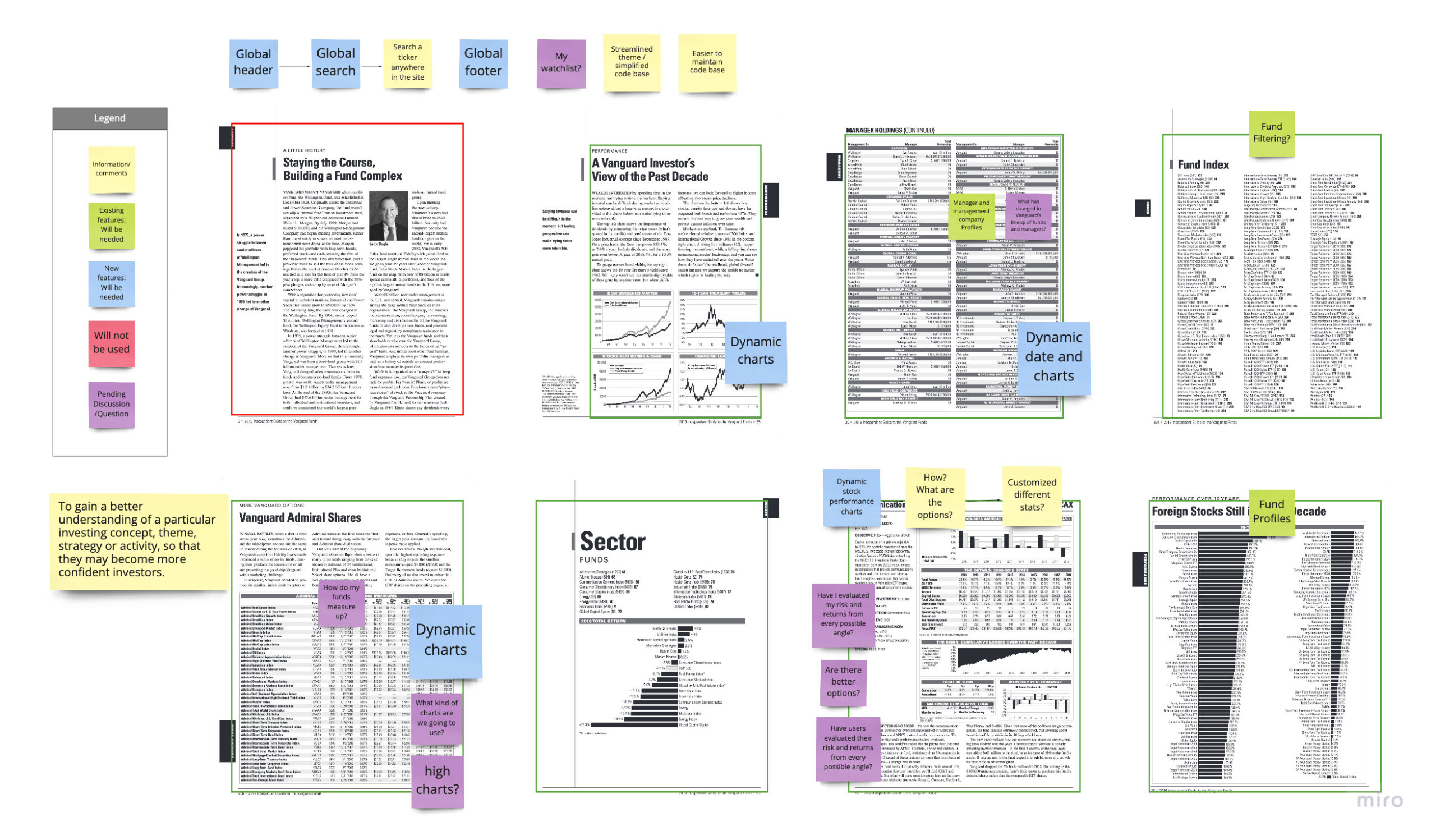
I conducted a detailed audit of the printed guidebook—analyzing every page to identify usability pain points and translate legacy content into scalable, digital components.
Key Findings
Cumbersome navigation
Users struggled to locate specific funds, managers, and companies via an alphabetical index.
Information overload
Small fonts, compressed graphs, and dense layouts made the book difficult to read.
Static content
Outdated charts and tables lacked real-time interaction and flexibility.
Process
User Flow and Low Fidelity Wireframe
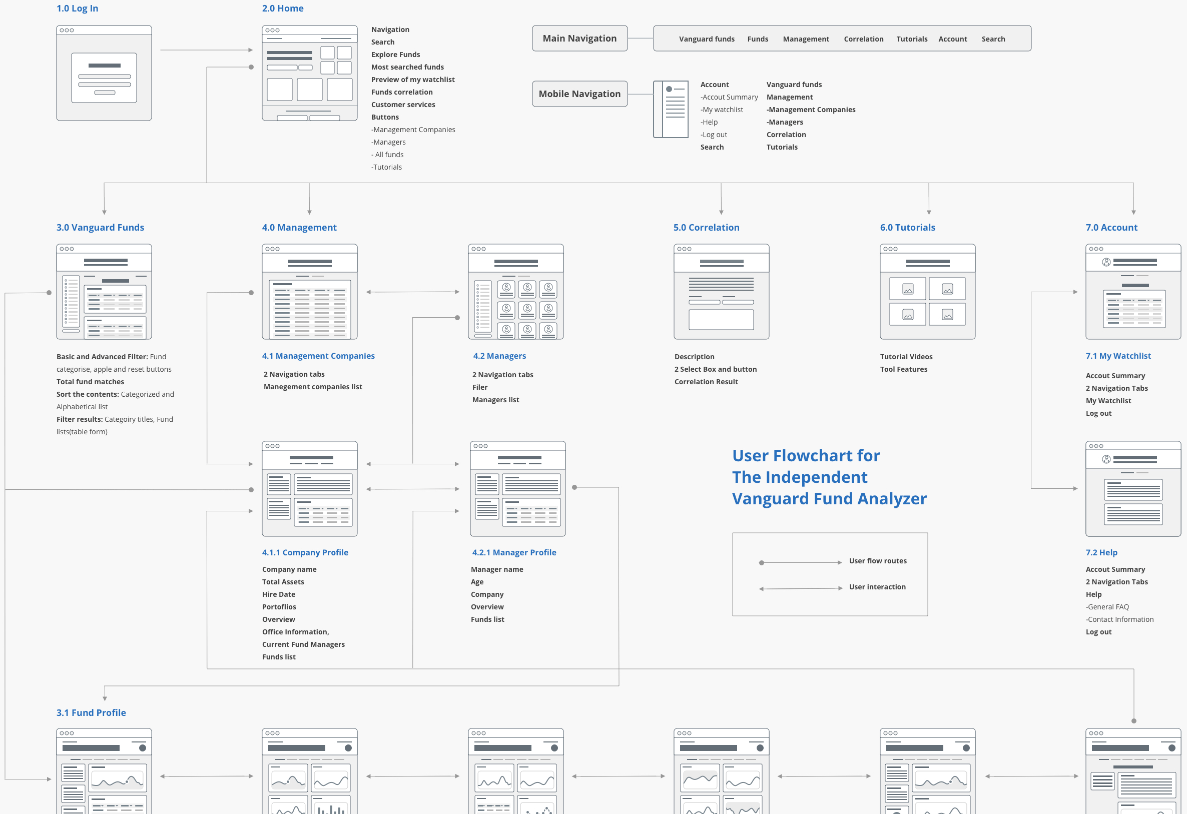
I created low-fidelity wireframes and user flows to validate and align site navigation.
Key solution
Clean and Minimal Interface for
Enhanced User Focus
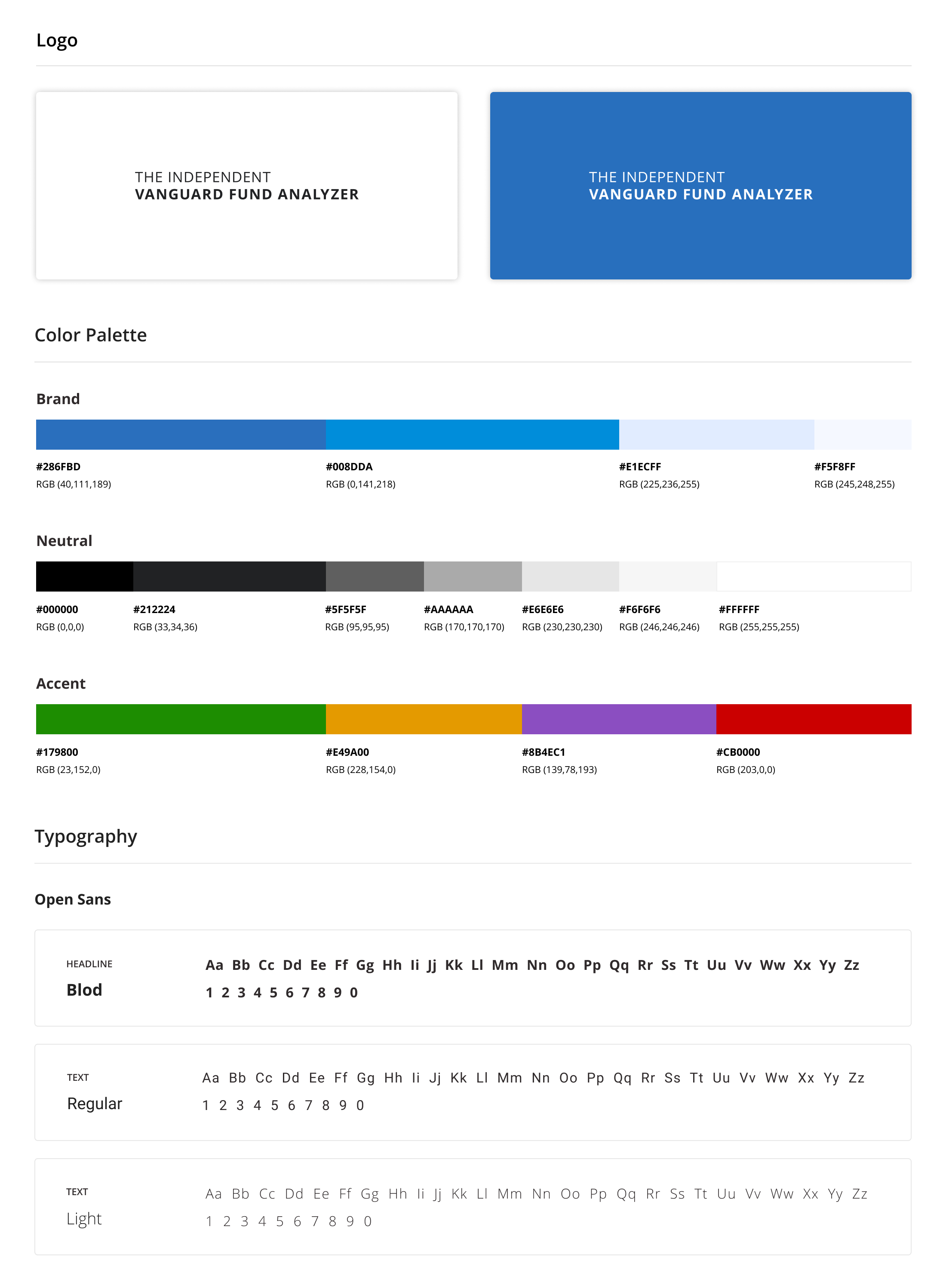
Open Sans was used as the primary typeface for its clarity and neutrality. I applied thoughtful font-weight variation and spacing to create a subtle hierarchy and reduce visual noise. A muted color palette with strong accents helped distinguish data without overwhelming the screen.
This approach wasn’t just visual—it was strategic. In early usability tests, users consistently described the interface as "calm" and "easy to scan," which validated our direction. The use of whitespace and clear modular layouts became essential to helping users digest the volume of content without fatigue.
Key solution
Streamlined Search Functionality for
Effortless Navigation
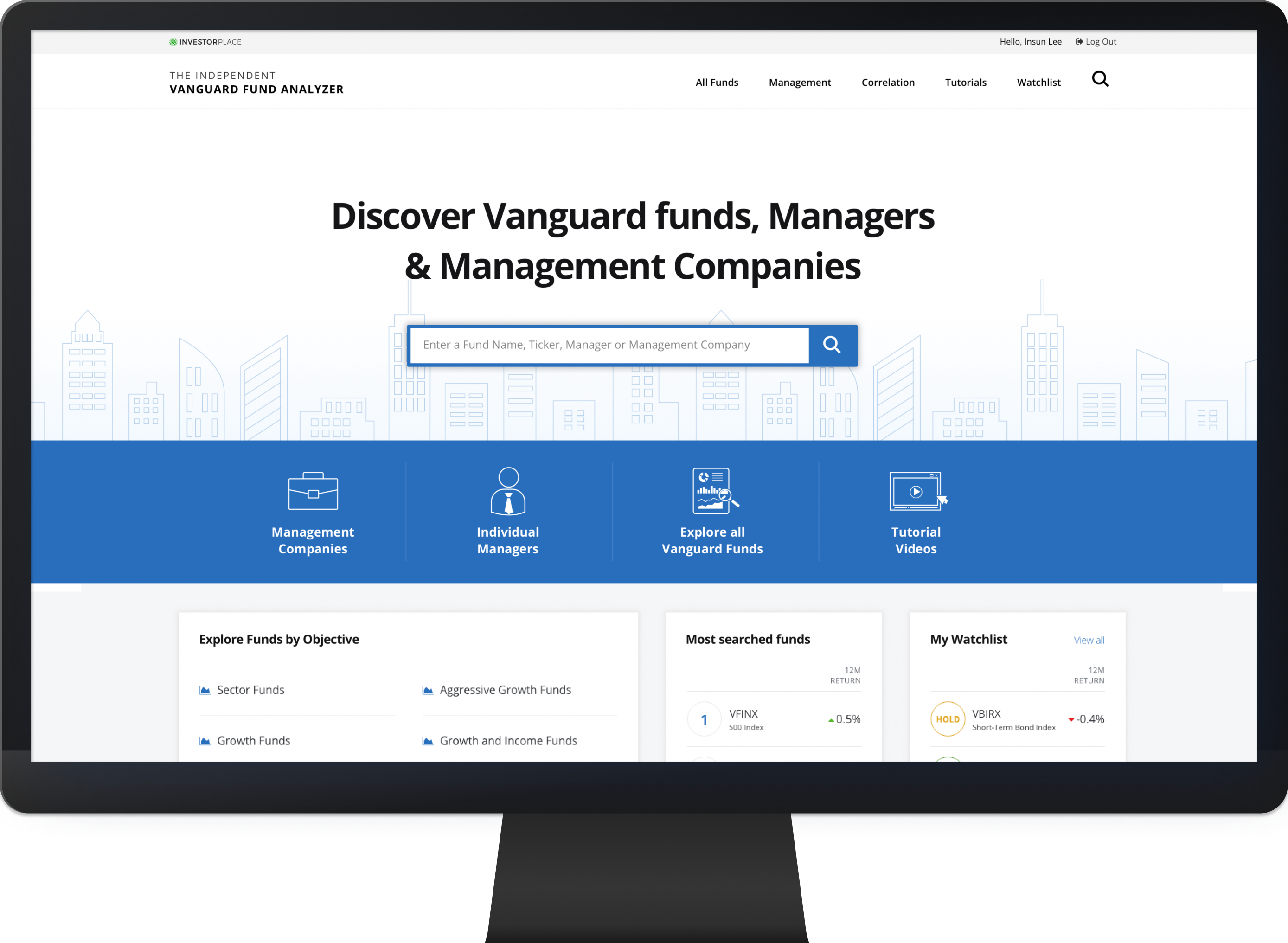
One of the biggest pain points in the printed guidebook was the lack of a fast way to find specific funds, managers, or companies—users had to manually scan alphabetized indexes across multiple pages. To solve this, we introduced a powerful global search feature that surfaces results instantly as users type. It dramatically reduced friction in the research process and helped users focus on analysis instead of navigation. This shift not only improved usability, but also reinforced trust by delivering information with speed and precision.
Key Solution
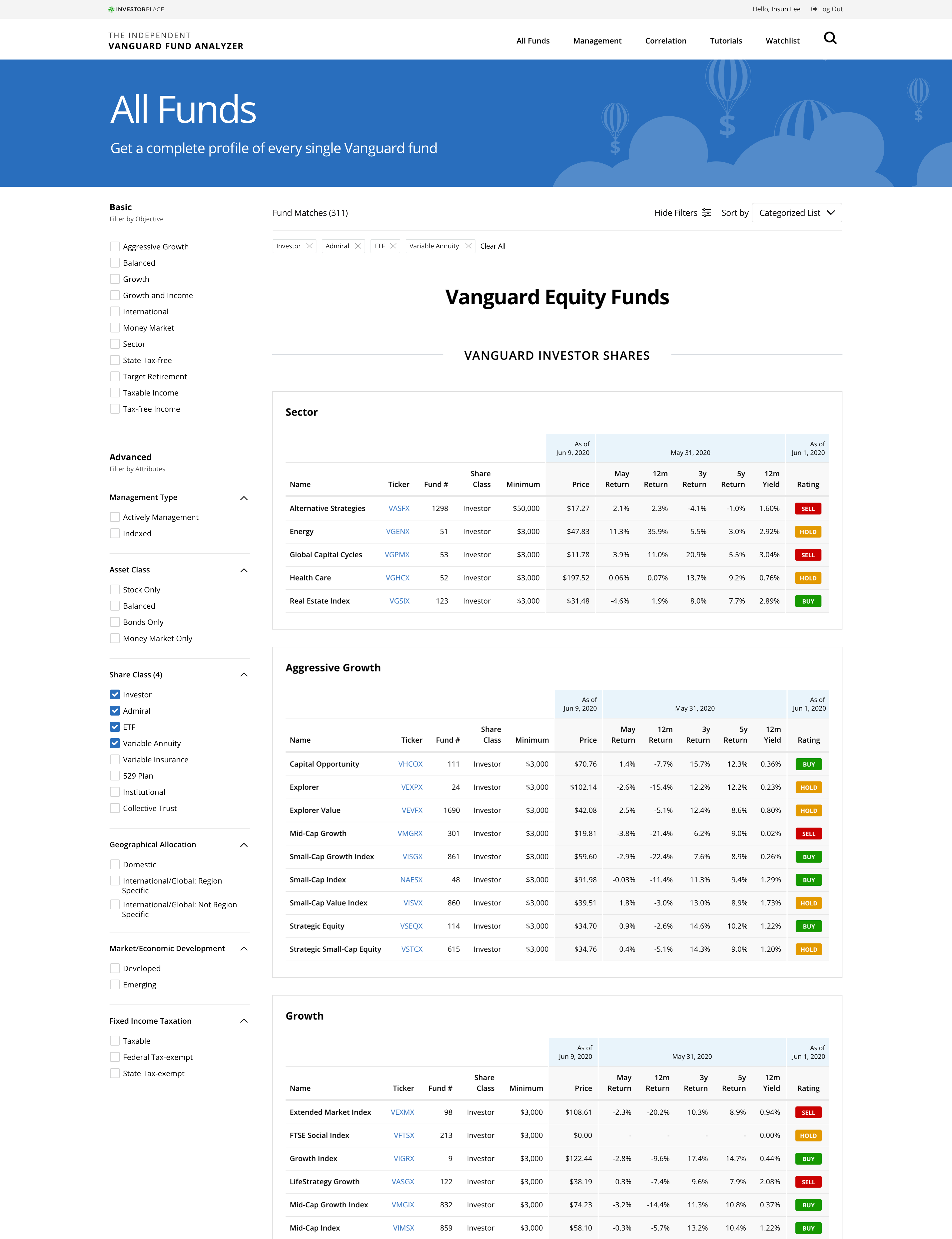
Customizable Vanguard Fund List
To replace the static index system from the guidebook, I designed a dynamic fund list with customizable filters. Users can narrow down hundreds of funds by applying filters such as category, performance, or Dan Wiener’s proprietary ratings. Each ticker links directly to its detailed profile, enabling smooth navigation.
What made this feature more impactful was the integration of Dan’s exclusive fund ratings—a unique value not available through Vanguard itself. I worked closely with the content strategist and editor to define meaningful filter categories, based on how investors think about and compare funds. To support quick scanning, I also implemented a color-coded badge system that visually distinguishes ratings at a glance.
This empowered users to create their own tailored fund views and compare top-rated funds more confidently.
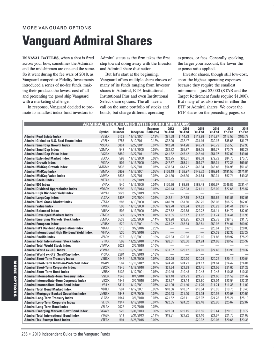
Fund list page in the book
Key Solution
Structured Fund Profiles with
Clear Information Hierarchy
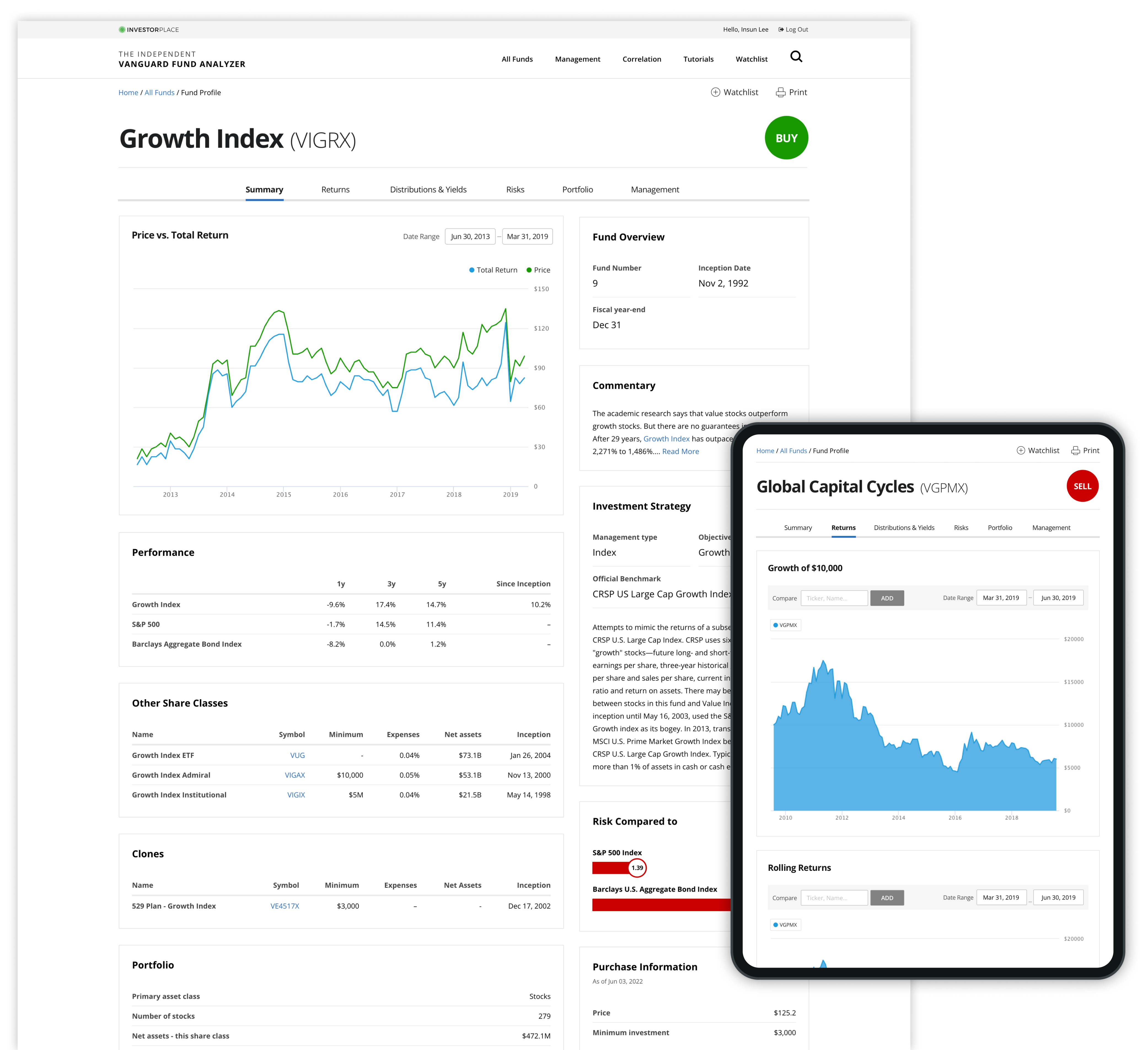
To help users digest dense fund data without getting lost, I restructured the profile pages using a modular design. Each fund profile was divided into clearly labeled tabs—such as Performance, Holdings, and Risk—allowing users to focus on one section at a time.
Within each tab, I used card-based modules to separate content visually and avoid cognitive overload. This layout strategy lets users scan complex metrics without feeling overwhelmed. To reinforce clarity, I applied a consistent type scale, spacing, and color contrast—creating a strong visual hierarchy while keeping the overall aesthetic clean.
This structure not only made the interface easier to navigate but also helped users interpret fund data faster and more confidently.
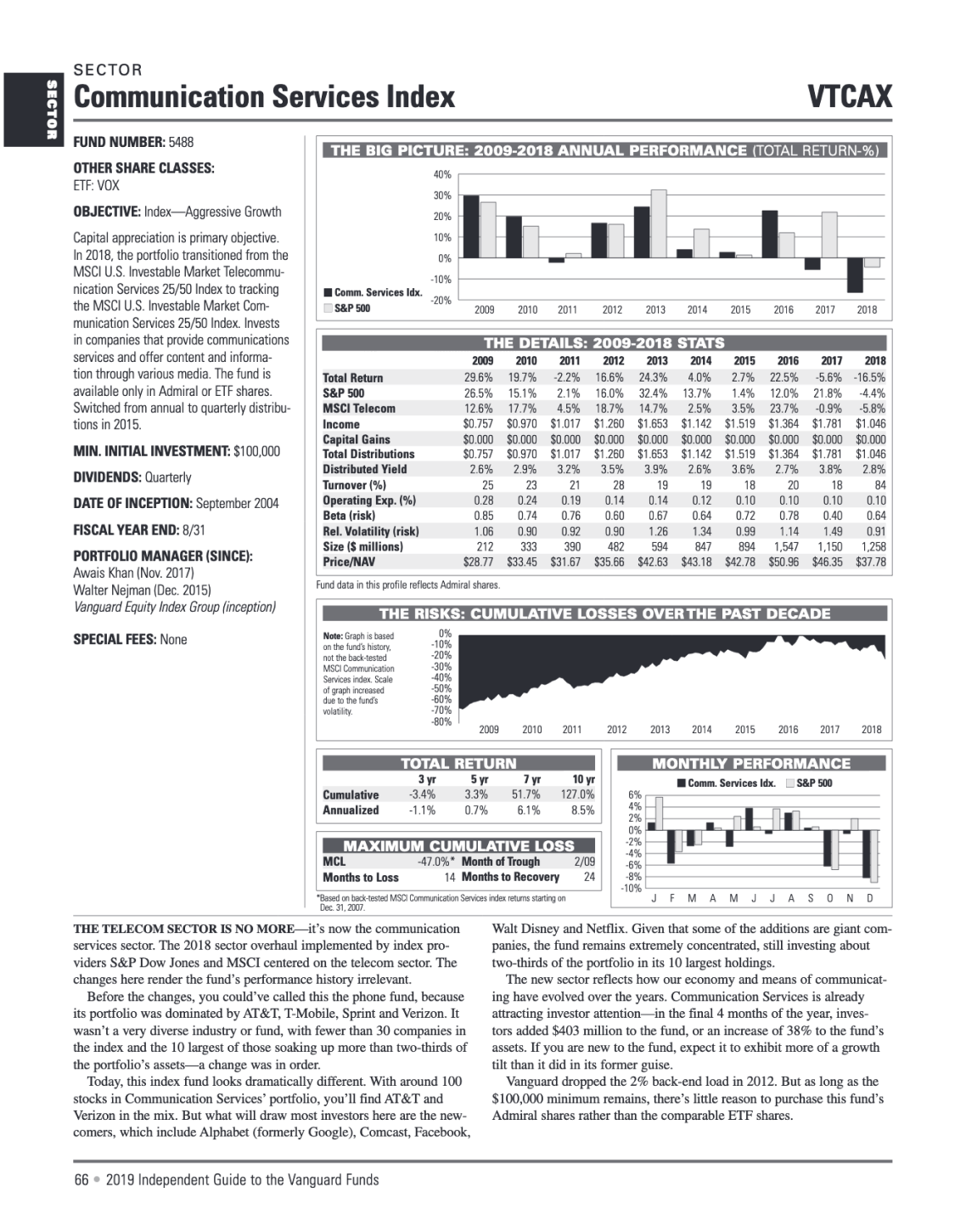
Fund profile page in the book
key solution
Dynamic and Interactive
Data Visualizations for Deeper Insight
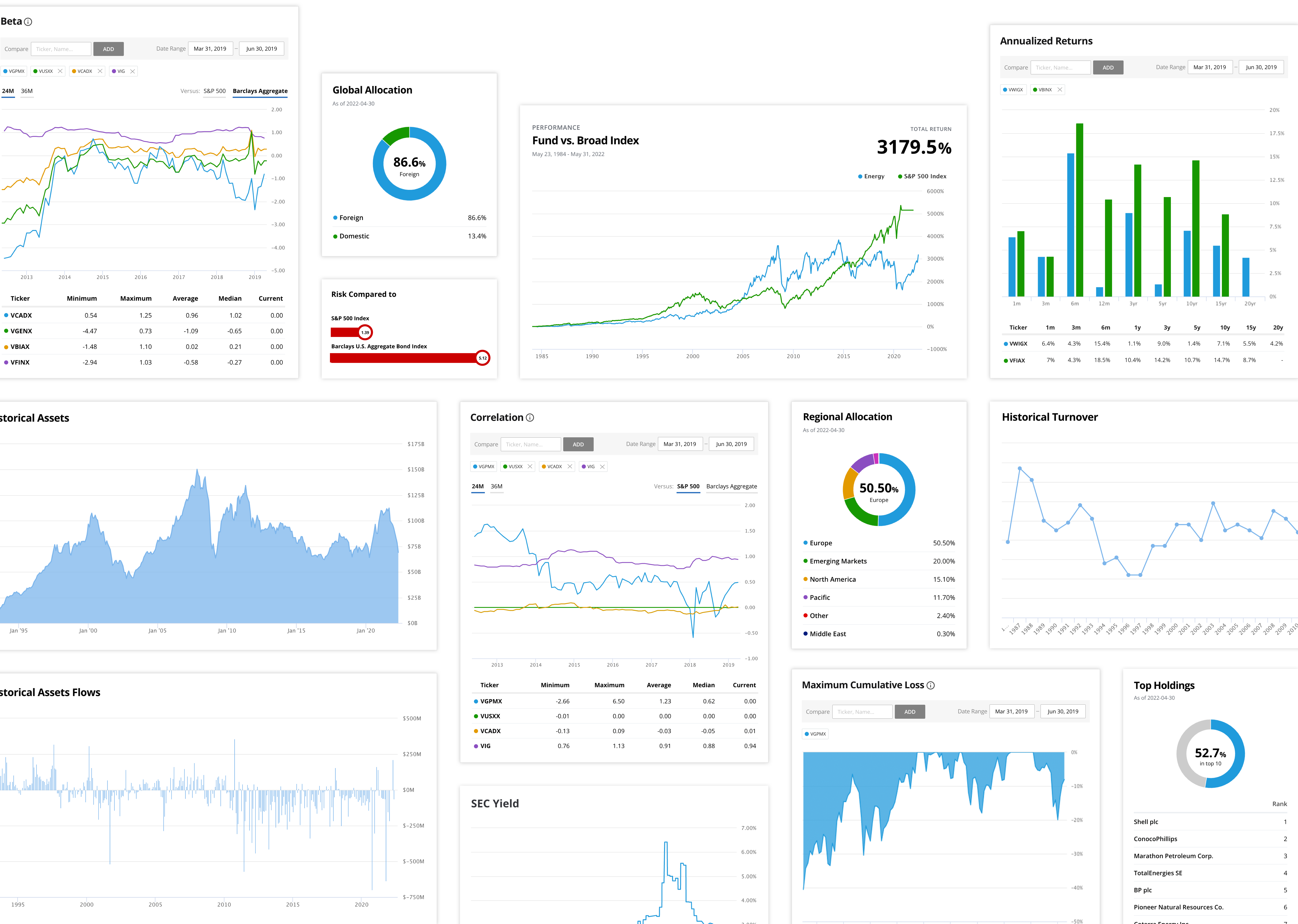
One of the key goals was to move beyond static tables and present data in ways that are easier to interpret and interact with. I worked closely with developers and editors to identify which datasets would benefit most from visual transformation.
For instance, we converted the global allocation section from plain text into an interactive donut chart. This change helped users instantly understand how a fund was distributed across different asset classes. We also introduced side-by-side fund comparison tools, allowing users to visualize differences in performance, risk, and holdings in a more intuitive way.
Throughout the design process, we tested various chart types and interaction models to ensure accessibility, clarity, and flexibility. The result empowered users to explore and compare fund data on their terms—a major improvement from the static, line-by-line reading experience of the print guide.
What I Learned
Turning complexity into
clarity through thoughtful design
This project challenged me to design for a new domain—financial data—while delivering clarity and trust through thoughtful UX. I learned how to translate complex, static content into interactive tools, collaborate deeply with editorial and technical teams, and design flexible systems that scale across content types.
One of my biggest takeaways was the value of balancing editorial voice with user-centered interaction. Since this project, I’ve carried this mindset into every data-heavy product I've worked on—prioritizing structure, collaboration, and simplicity to empower users in even the most complex domains..
©2024 Insun Lee All rights reserved.