InvestorPlace
Connect world-class investment advice with investors
Redesigning a financial content platform to boost engagement and clarity
InvestorPlace is one of the largest independent financial research firms, offering investment analysis and subscription-based financial tools. Its flagship site, InvestorPlace.com, is a major source for market news and insights—but it was held back by poor navigation, slow loading speeds, outdated visuals, and limited functionality caused by a legacy design. Customer complaints highlighted these issues, prompting the company to view them as an opportunity for transformation.
I led the website's redesign and rebranding, with a clear focus on improving usability, modernizing the interface, and enhancing the overall user experience on desktop and mobile.
Responsibilities
User Research
User Experience Design
User Interface Design
Visual Design
Prototyping
User Acceptance Testing
Goals & Results (9 months post-rollout)
As part of the redesign strategy, we defined specific goals targeting three key user groups: subscribers, returning users, and new visitors.
Subscribers
Increase brand awareness across InvestorPlace products
+7.7%
New Users
New Users
Reduce friction and motivate return visits
+15%
Total Sessions
+23%
Average Session Duration
New Users
Lower bounce rates and boost content exploration
-16%
Article Bounce Rate
+9.3%
Pages Per Session
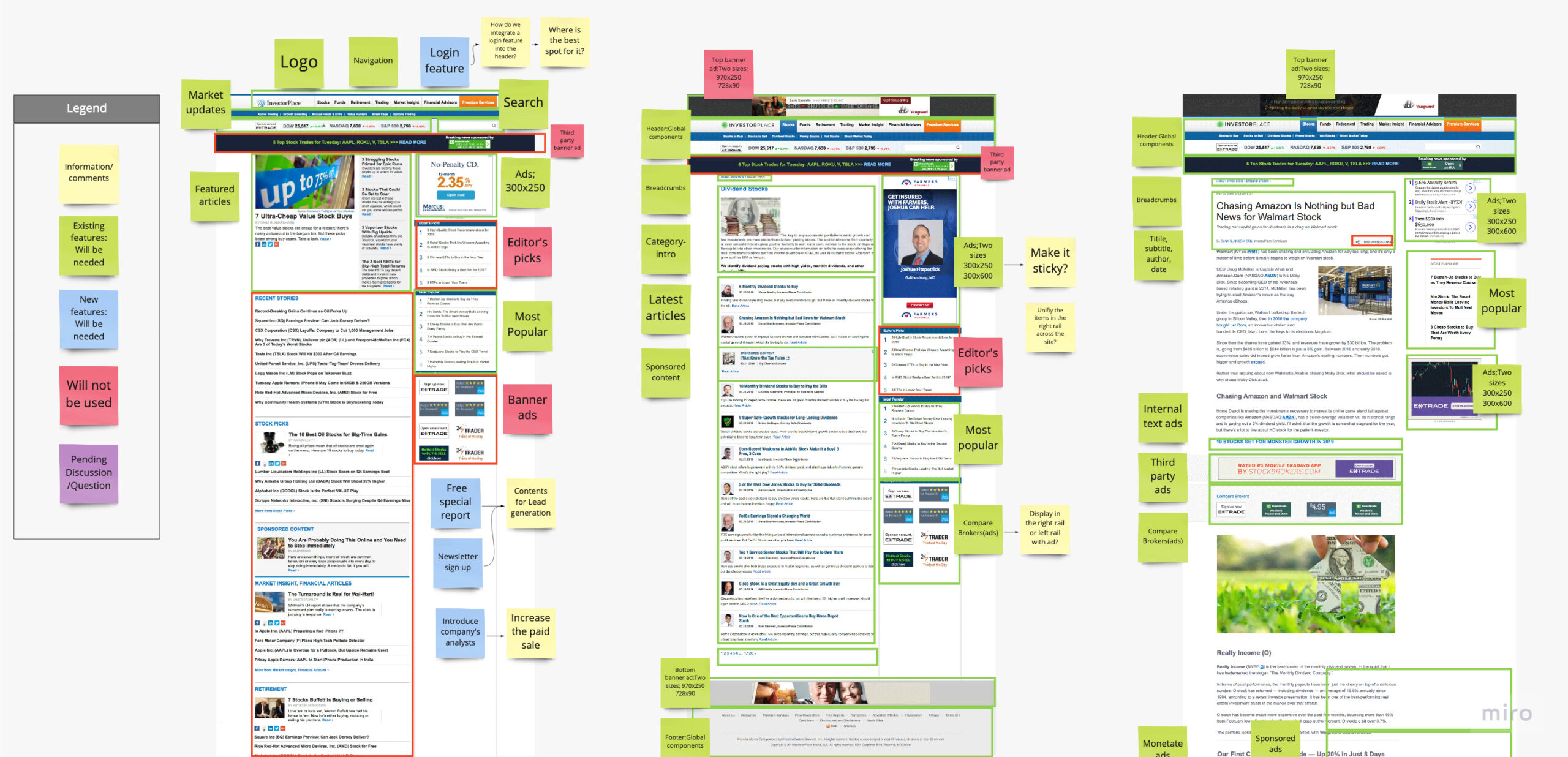
Discovery
Locking Down Redesign Requirements
To prepare for the redesign, we partnered closely with key internal stakeholders—including editorial, product, and marketing teams—to align on business objectives and define clear design requirements.
We also conducted an audit of the existing InvestorPlace.com, identifying critical UX pain points. Our focus areas included simplifying layout structure, improving site-wide navigation, and ensuring full mobile responsiveness to meet modern user expectations.
Research
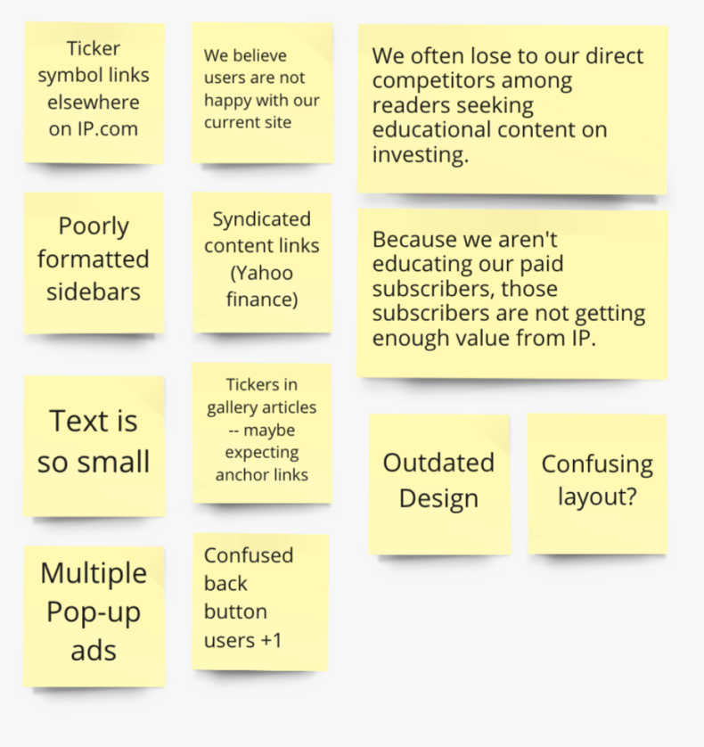
Understanding User Pain Points
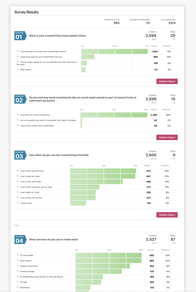
To better understand user frustrations, we collected insights from multiple channels—including the customer service team, user surveys, and Google Analytics. This multi-channel approach allowed us to validate patterns in user frustration and shape our redesign strategy around the most pressing issues.
Our goal was to enhance the overall experience by directly addressing the most critical barriers users faced while engaging with InvestorPlace.com.
User Feedback
User Survey
Google Analytics
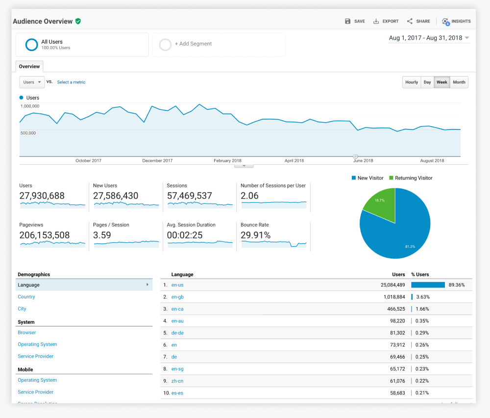
Key Findings
Lack of Visual Hierarchy & Layout Flexibility
The legacy design lacked a clear visual hierarchy and offered limited layout flexibility, making it difficult to present different types of content effectively. This negatively impacted engagement and reduced pages per session.
Limited Brand Awareness Across Products
InvestorPlace’s product offerings were siloed, leaving many subscribers unaware of the full range of tools and services. This limited brand recognition and cross-product discovery.
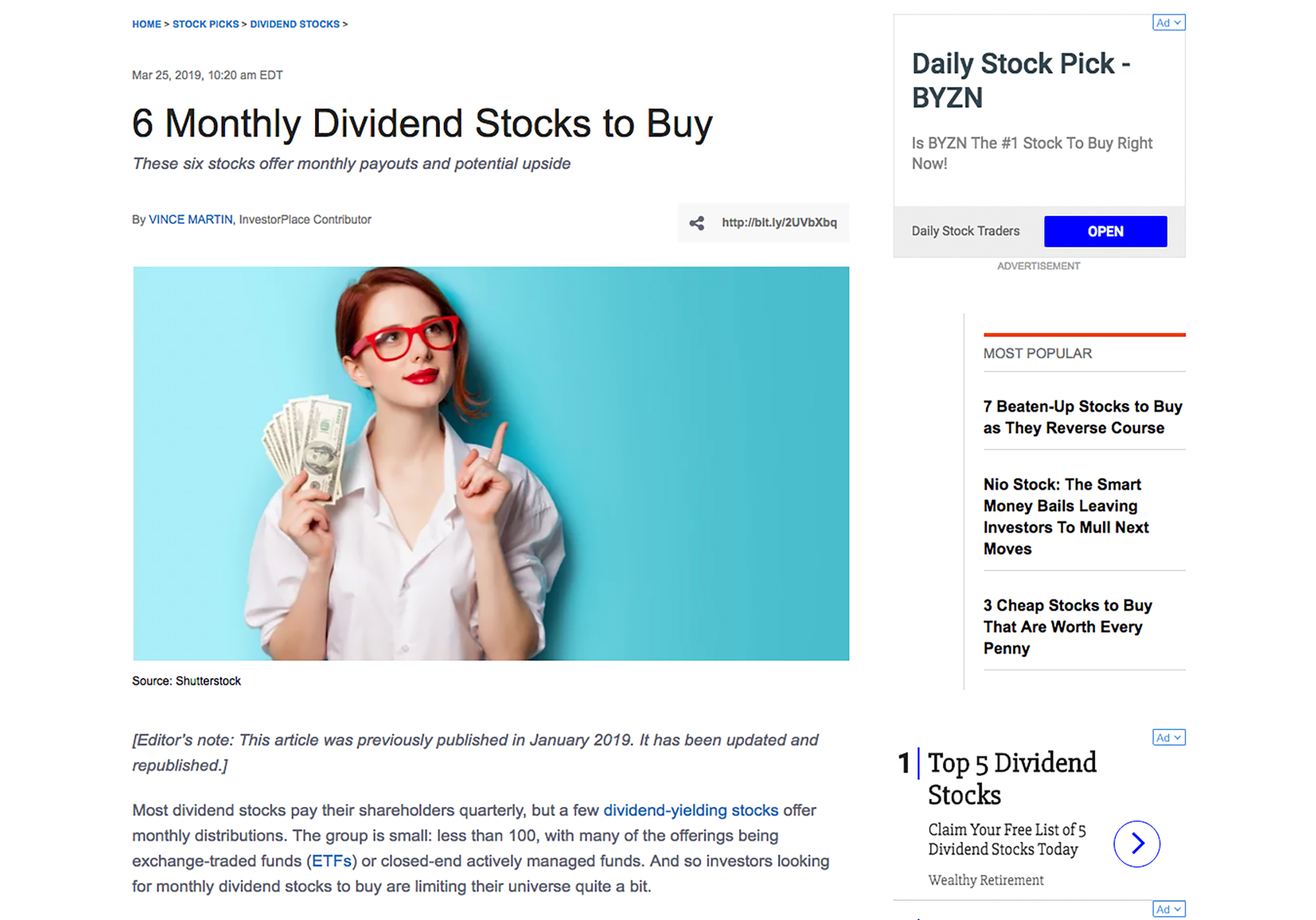
Disruptive Ad Placements
Intrusive and poorly placed ads—especially within article content—negatively affected readability. This frustration was a key contributor to high bounce rates on article pages.
Poor Mobile Experience
The mobile version of the site lacked clarity and consistency with the desktop layout. Users struggled to navigate and locate content on smaller screens, resulting in reduced engagement and poor satisfaction on mobile.
Ideation to Execution
From Strategy to Solutions
With clearly defined user pain points and business goals, we entered the ideation phase to explore actionable solutions. Through collaborative brainstorming and cross-functional alignment, we generated a wide range of ideas and evaluated them based on feasibility, user impact, and alignment with business objectives. This process led us to five key solution areas that addressed both user experience gaps and strategic priorities.
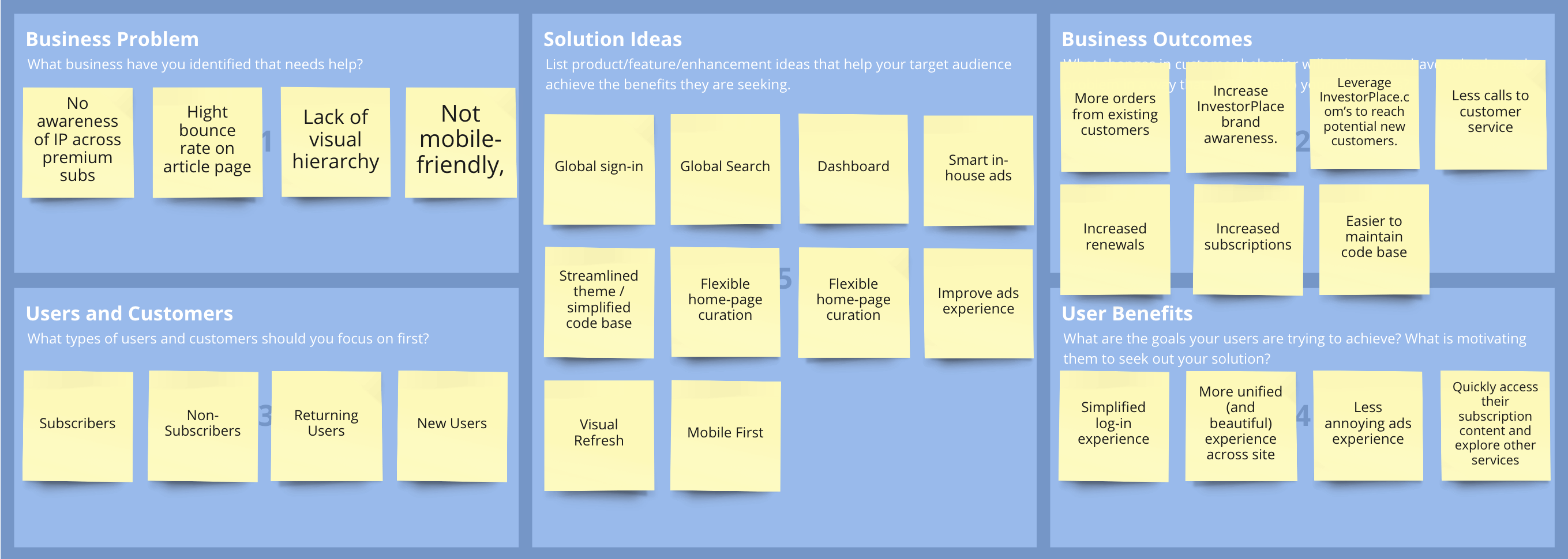
Key solution
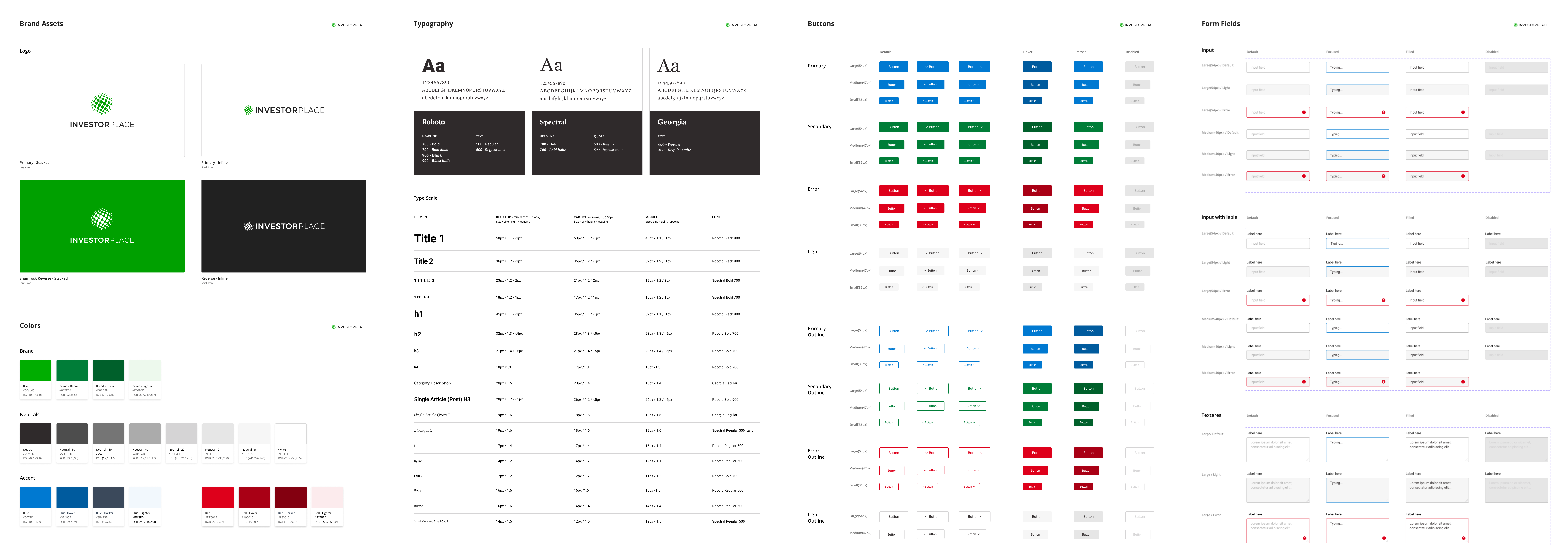
Modern and Consistent Visual Design
To enhance brand recognition and trust, we unified the visual identity across InvestorPlace and InvestorPlace.com. A green-centered color palette was introduced, paired with a bold and modern sans-serif typeface. The logo was also refreshed to reflect a more contemporary, professional tone.
All interface components were documented in Figma to promote design consistency, reusability, and seamless handoff to development.
Before
After
Key solution
Enhance Visual Hierarchy and Content Flexibility
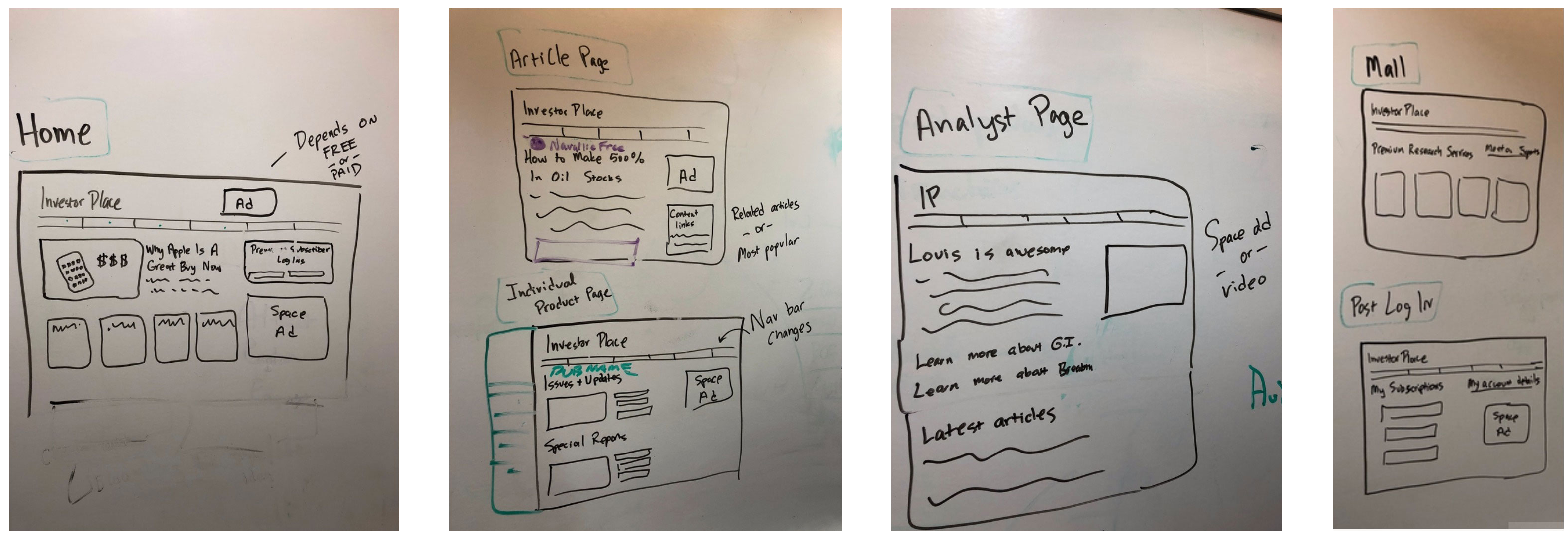
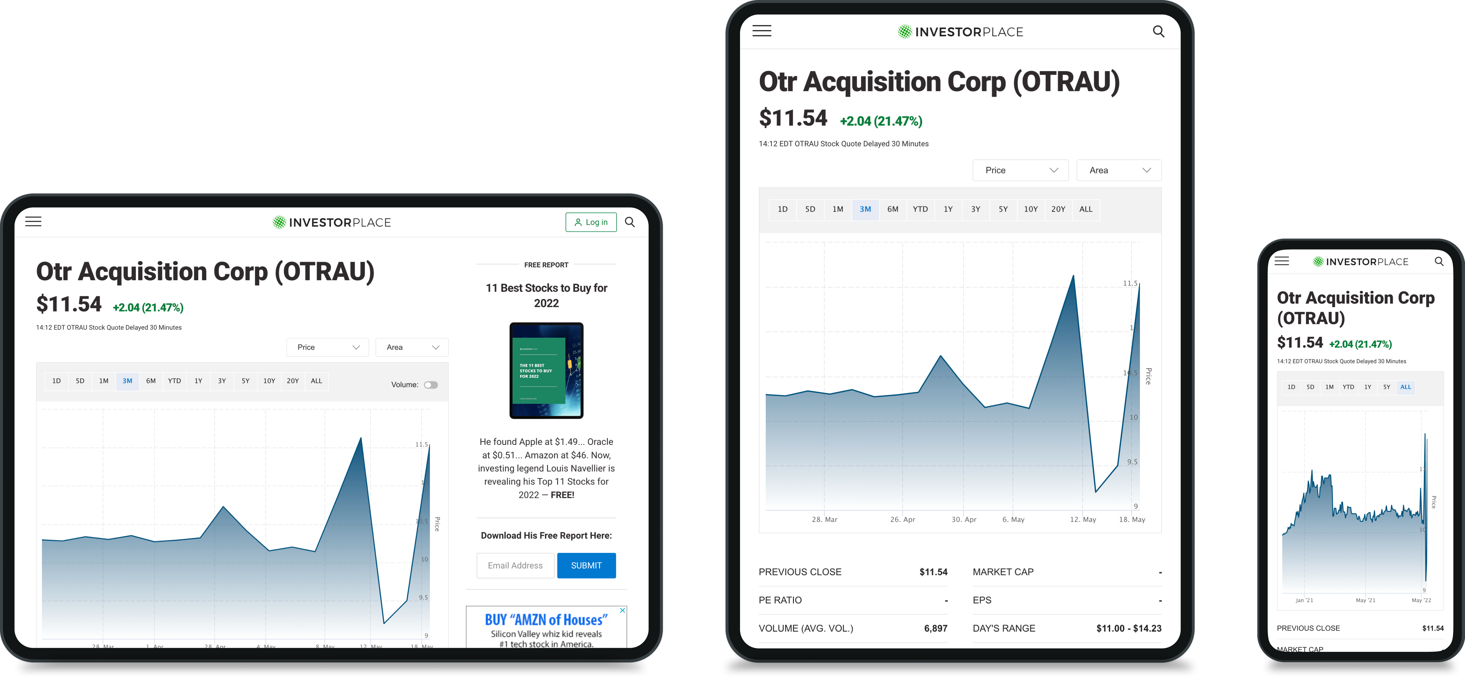
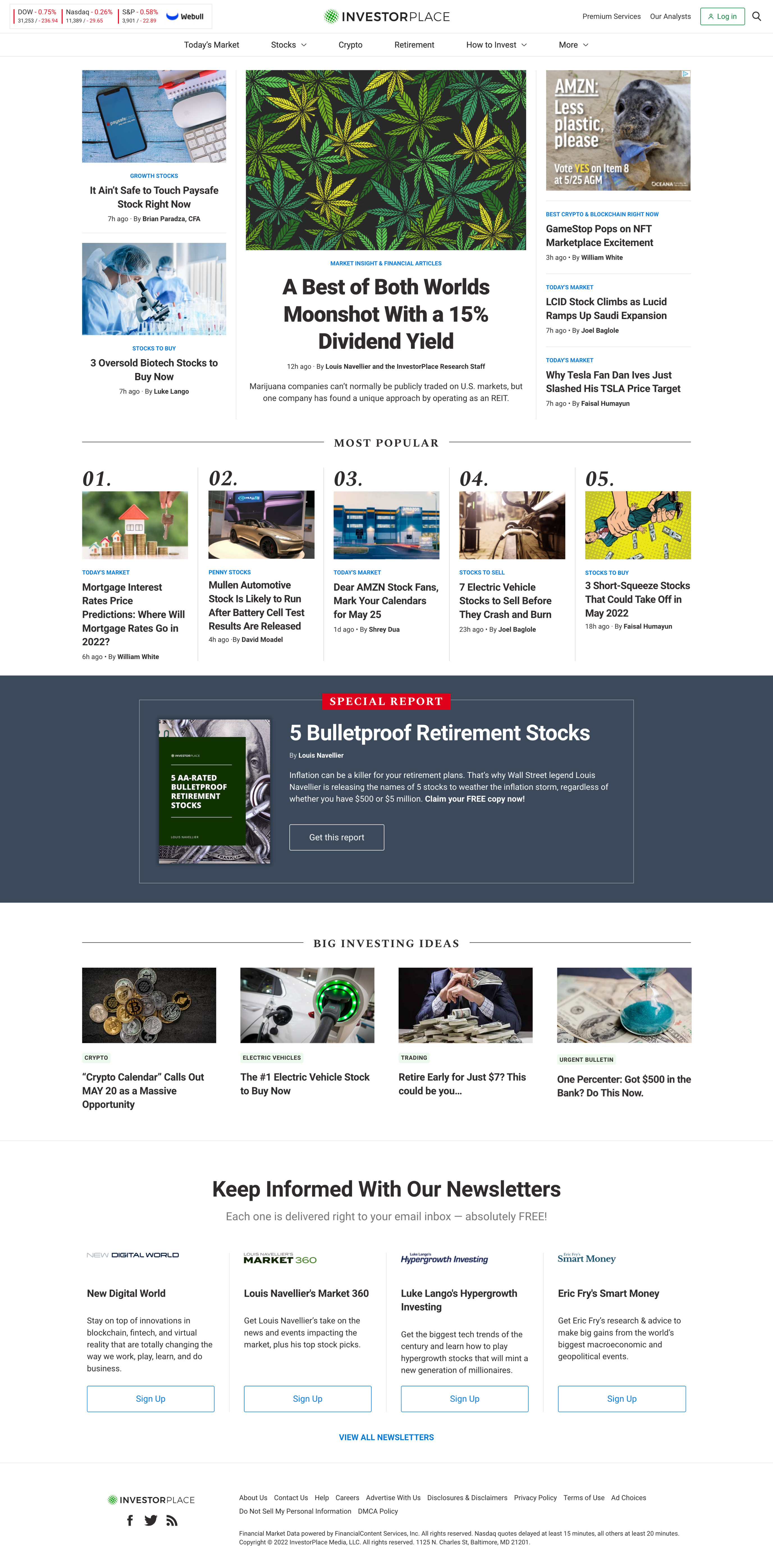
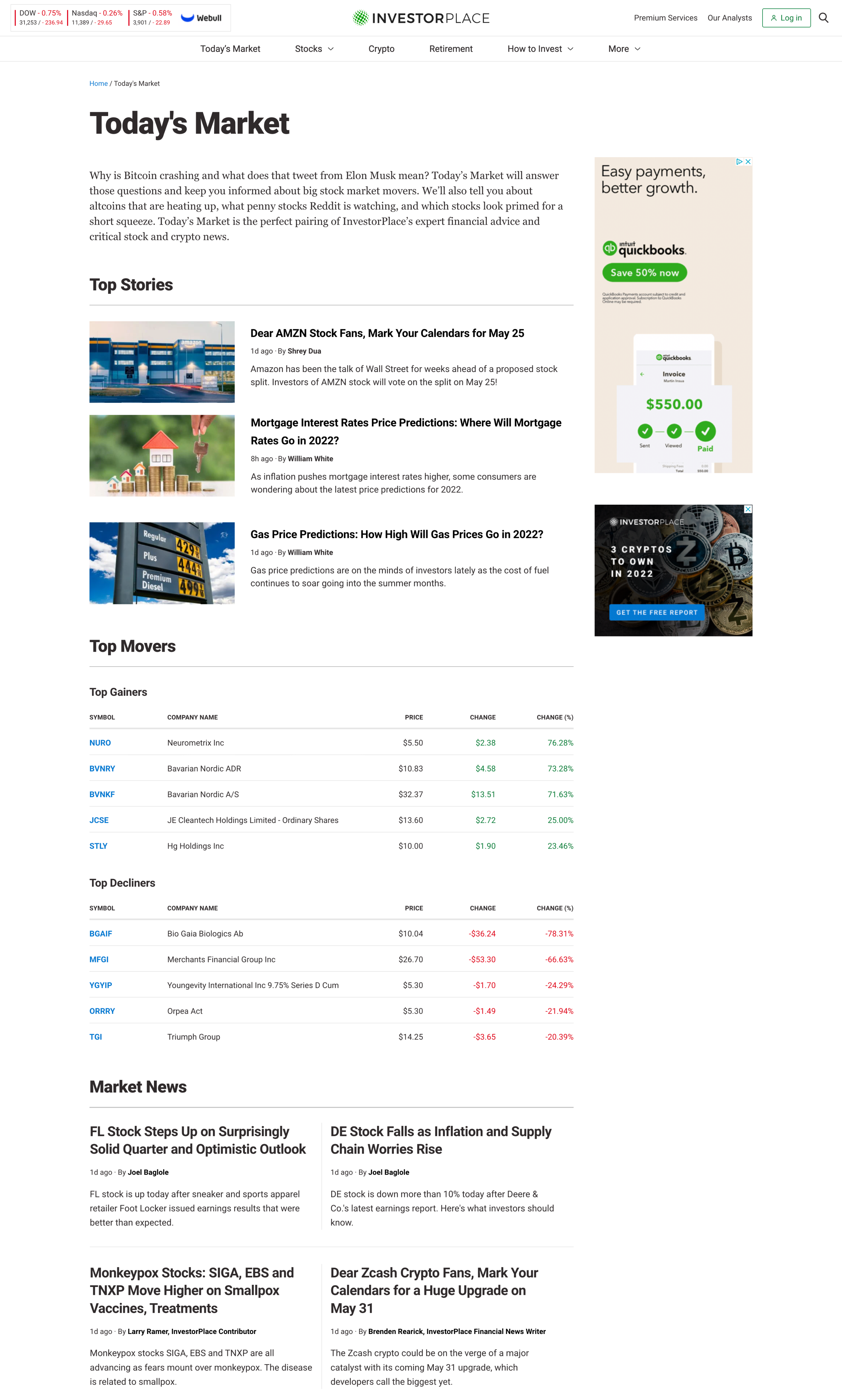
Investorplace.com is a content-heavy site. The old site had messy visual hierarchies and lacked flexibility, which made it difficult for users to gauge the importance of different content quickly. Adopting a modular design approach, We improved visual hierarchy and flexibility by implementing various block grid systems. This allowed for logical content grouping, easing navigation for users.
Home Page
The homepage layout was simplified with a reduced color palette and clear content containers. This not only improved visual clarity but also empowered editors with better layout control.
Drag the slider sideways to see before and after images


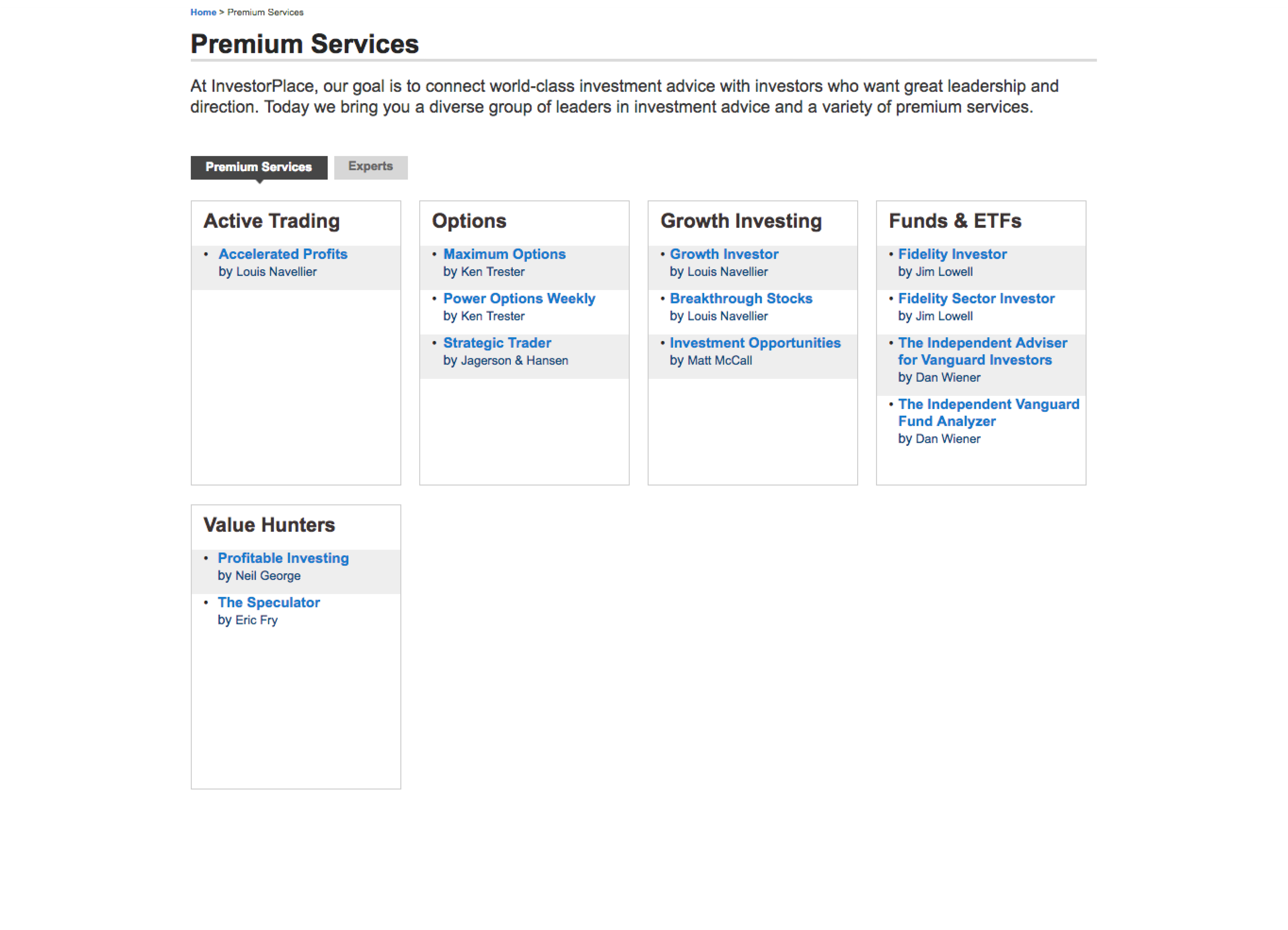
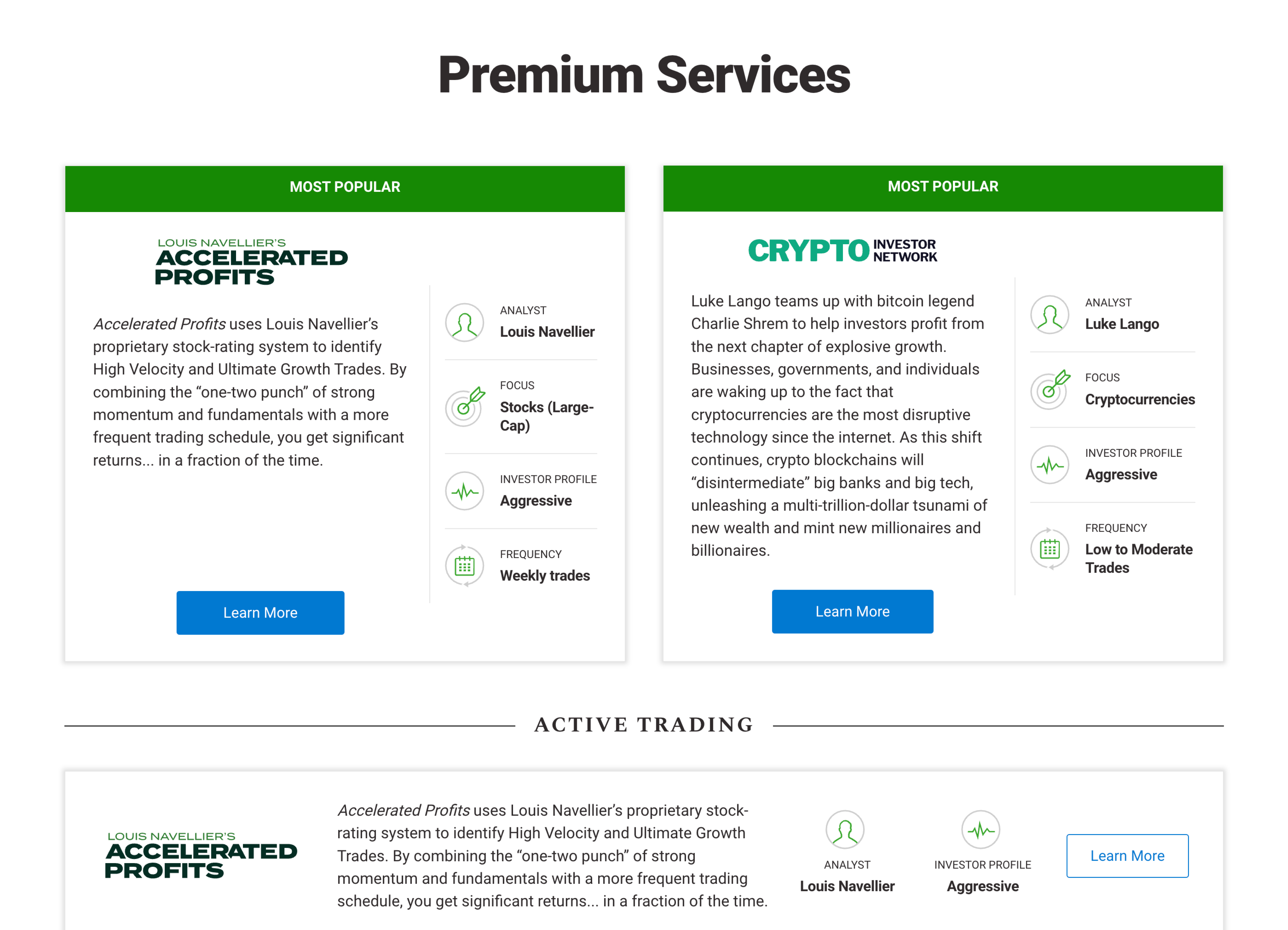
Premium Services Page
Previously lacking context and clarity, the premium page was redesigned to highlight popular services and provide essential details up front—improving both user understanding and conversion.
Drag the slider sideways to see before and after images
Key solution
Promoting Cross-Product Awareness
with a Central Hub
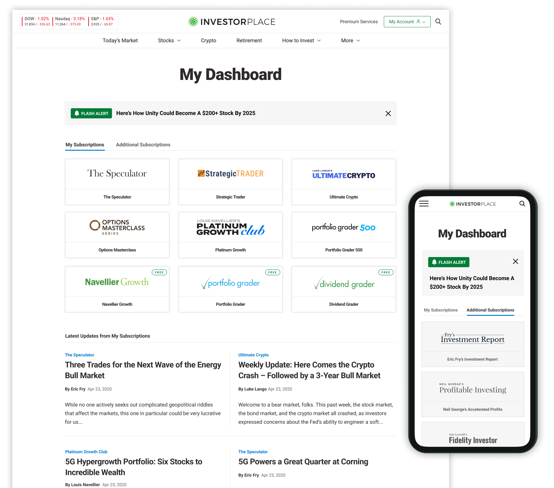
To strengthen product discoverability among existing subscribers, we repositioned InvestorPlace.com as a central hub. By introducing account logins and personalized dashboards, users were now able to seamlessly access premium content and explore other offerings.
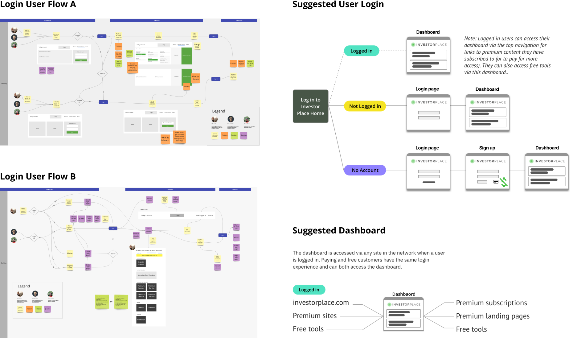
Account Login
Users could log in directly from InvestorPlace.com to access their subscriptions, creating a more unified experience.
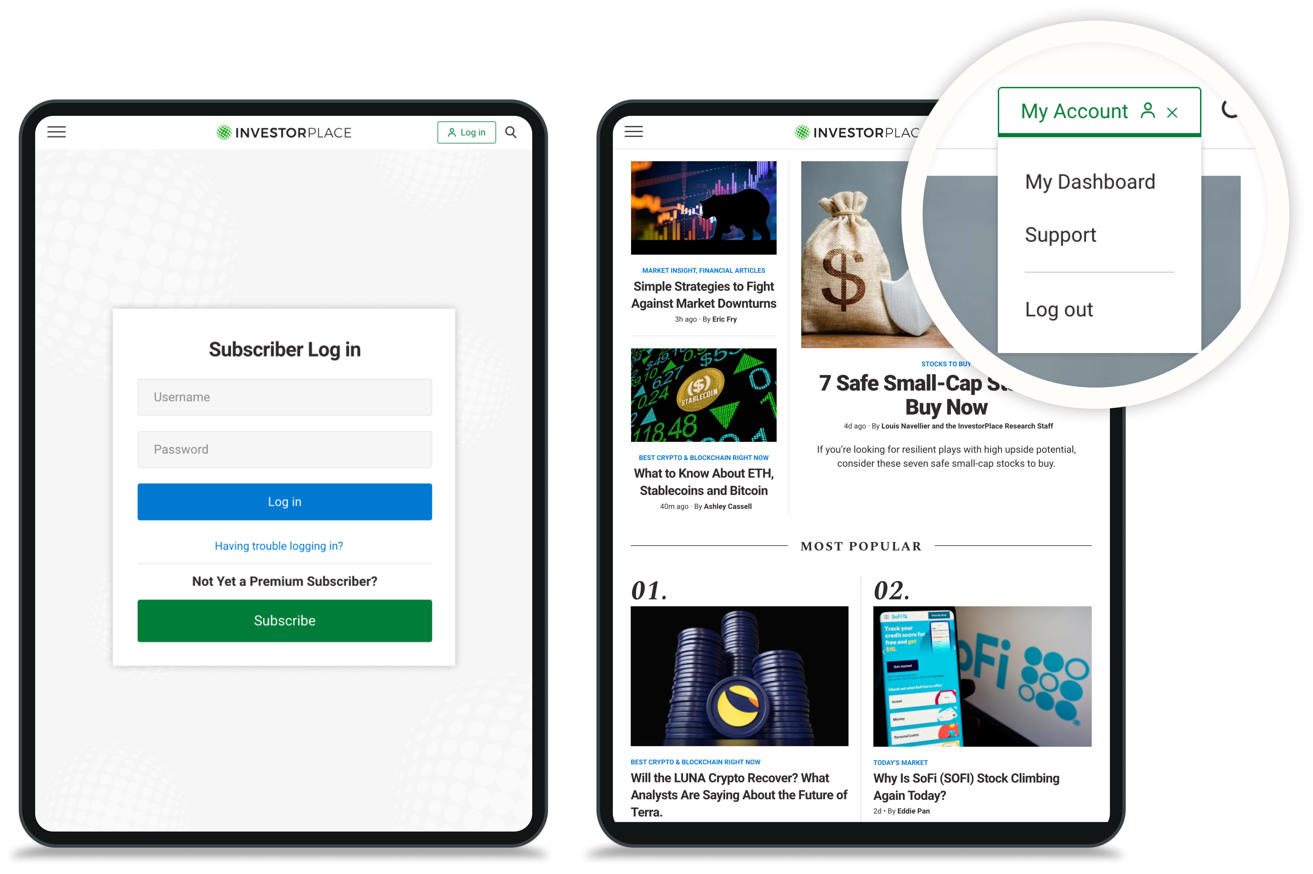
Dashboard
We designed a centralized dashboard to help users manage active subscriptions and discover other premium services. The interface prioritized ease of use and consistency, while integrating subtle cross-product promotion to encourage upgrades and deeper engagement.
Key solution
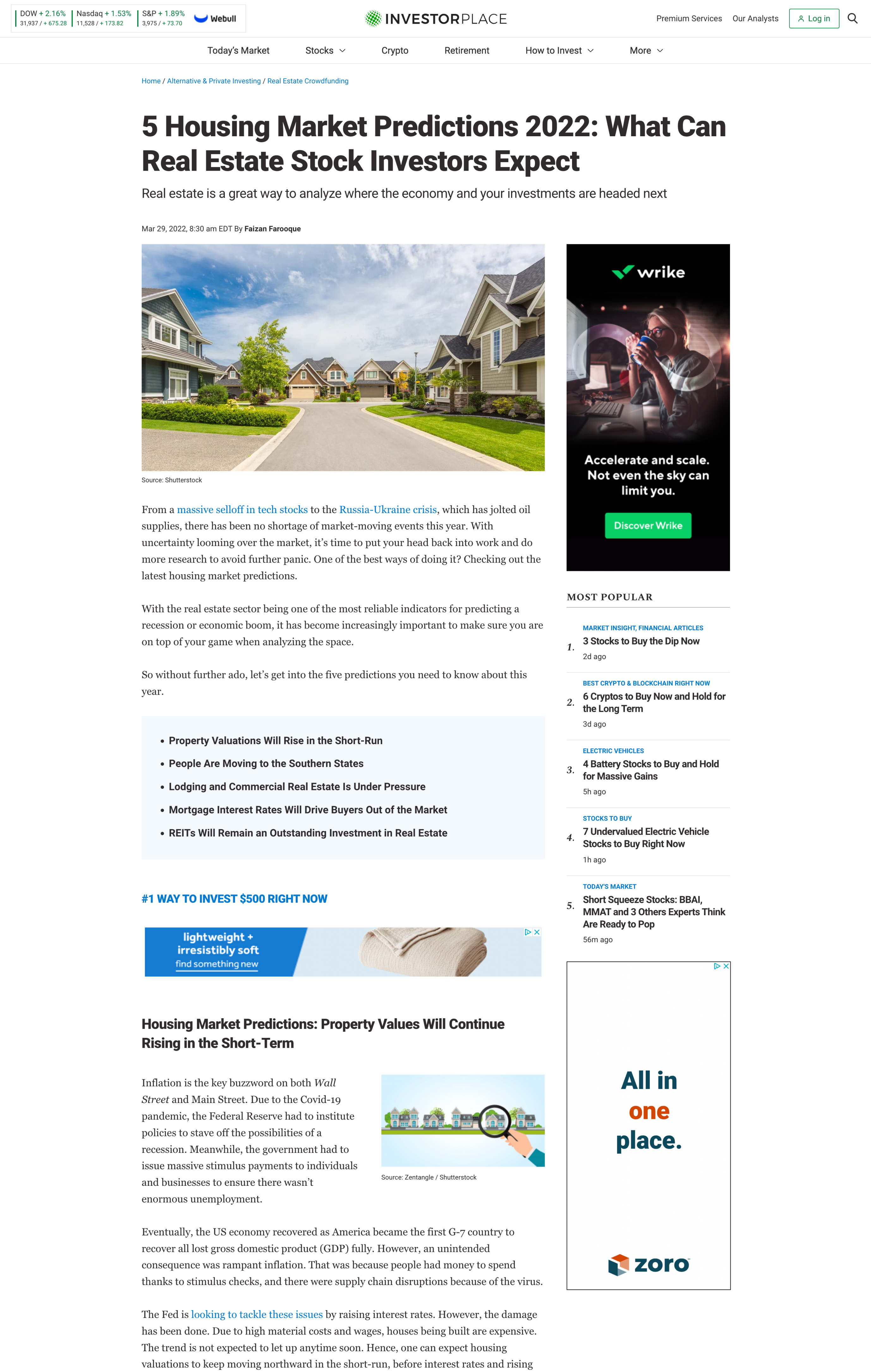
Optimized Article Page Experience
As the most frequented page type, article pages were critical to engagement. While users wanted a clean, ad-free experience, business goals required maintaining ad revenue. Our redesign focused on improving speed, layout, and minimizing ad disruption.
- Conducted competitive analysis to benchmark performance and ad standards.
- Replaced disruptive inline popup ads with lazy-loading ads for smoother scroll experience.
- Transformed the lower-right ad into a sticky format, preserving visibility without overwhelming the reader.
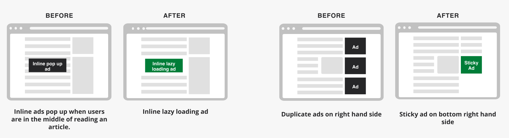
Drag the slider sideways to see before and after images
Key solution
Seamless Cross-Device Experience
Mobile accounted for 58% of overall traffic, yet the legacy design failed to deliver a coherent mobile experience. Users struggled with unclear navigation and inconsistent layouts. We implemented a mobile-first responsive design approach to ensure consistency across devices. Navigation patterns were simplified and aligned with the desktop experience, resulting in better usability, engagement, and content discoverability on smaller screens.
Final design
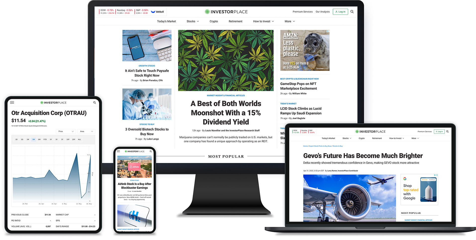
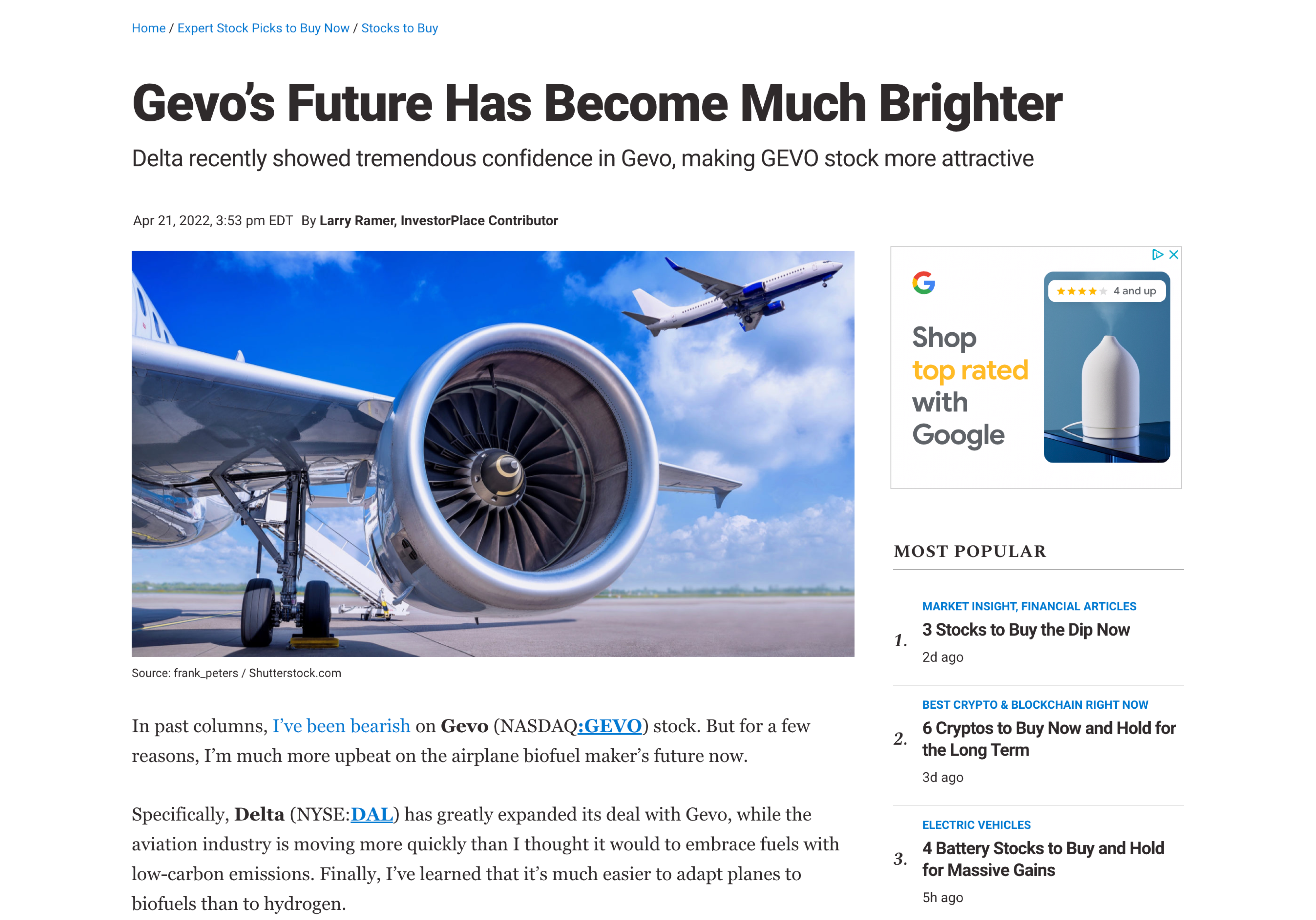
Clean, Bold, and Cohesive
The redesigned InvestorPlace.com delivers a bold, modernized visual identity that reflects the brand’s authority and clarity. Every page—from homepage to article templates—was thoughtfully redesigned with a clean layout, strong hierarchy, and unified branding.
This final UI showcases a cohesive user experience across devices, content types, and user journeys—bringing clarity to complexity while reinforcing trust through design.
Outcome
Measurable Impact Across
Engagement, Speed, and Retention
The redesigned InvestorPlace.com delivered a measurable boost in both user engagement and site performance.
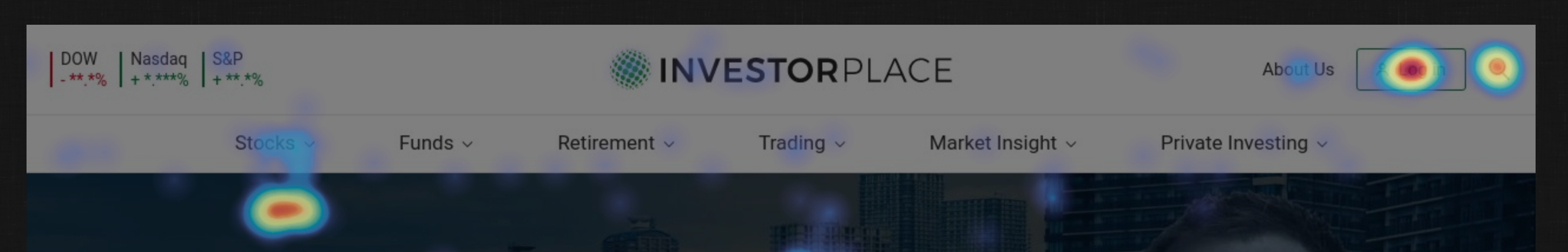
User Interaction Insight
Post-launch heatmap analysis revealed a significant increase in user interactions with the header login button—suggesting heightened awareness of subscriber features and a stronger intent to engage with premium content.
Performance Improvements:
-22%
Average Article Page Load Time
-39%
Homepage Load Time
-16%
Article Bounce Rate
Engagement Metrics:
+15%
Total Sessions
+7.7%
New Users
+23%
Average Session Duration
+9.3%
Pages Per Session
These results demonstrate how design improvements—grounded in user research and business goals—can drive meaningful product transformation.
*Source from 10up.com
What I Learned
Stepping Into Creative Leadership
This was the first project I led end-to-end without a design director—and it was a big one. From defining the design vision to making day-to-day decisions, I was responsible for driving the entire user experience and creative direction.
One of the most valuable lessons I learned was how to communicate more strategically with stakeholders. I had to go beyond presenting visuals—I needed to frame design conversations around user value, business goals, and the “why” behind every choice. It pushed me to adapt my voice depending on the room, and build stronger alignment across teams.
I also grew more confident in:
- Leading cross-functional collaboration and keeping momentum across disciplines
- Making design decisions at scale while maintaining consistency
- Advocating for user needs while balancing internal priorities
This project helped me realize I could lead with clarity—even without a safety net. It challenged me in the best ways and gave me a deeper sense of ownership, not just over the work, but over the process that shapes it.

©2024 Insun Lee All rights reserved.